{16} Color, Tech Stacks & Space
Featuring Vitaly Friedman, Nick Bryant, Ryan Watkins, Vincent Will, and Amazing Astronomy
Design & UX: Colors
Vitaly Friedman


Simple design rule, but it can make all the difference. Using a color system where the background color is a light or dark variant of the foreground color makes the interface more inviting.
If you want to incorporate this technique but color is a foreign language, check out the Material Color Tool.
Development: Tech Stacks
Nick Bryant

It’s interesting to see how tech stacks evolve. Two years ago, Slack would absolutely be a must for communication or project management. Prior to that, teams used Trello, Asana, and Jira.
All of the companies I mentioned are still alive and well. They’ve just lost favor in the startup community. It’s natural for a growing company to move up market and focus on the enterprise.
Every time a company moves up market, it paves the way for a scrappy new startup to come in and try something new. If I had to guess which tech from Nick’s list is ripe for innovation, I’d say Cloudflare and CDNs. Content delivery networks should have a 1-click setup with a better interface for browsing and managing assets.
Emerging Tech: NFT Usage
Ryan Watkins


DeFi has been a major selling point of crypto for years. Unfortunately, I don’t think the average crypto user cares deeply about decentralized finance. Crypto needs to grow by piggybacking on use cases people care about.
NFTs are a great use case. I know they are loaded with scams. The tech and the market both need to evolve. But I spent a lot of time in 2022 designing generative art NFTs on a platform called fx(hash). We’re going to figure this thing out and change the way people think about asset ownership.
Unsolicited Feedback: Iteration
Vincent Will


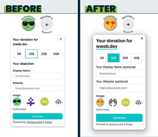
Overall I think the after version is better. Some of the elements from the before version are a bit crisper. Here’s my take in more detail:
The heart eyes in the new emoji are more thematic. I’m confused by mouth. It gives off a hipster indifference vibe. The disconnect between mouth and eyes makes me think there is a better emoji option.
The heading (Your donation for wweb.dev) feels more size appropriate in the before version. I know you want that element to be high on the visual hierarchy. So while the first heading feels nicer to me visually, maybe a font size between the two options would be a better compromise.
The highlighted selection in the after version is much nicer. Not only is it more obvious, it does a better job of balancing the weight of the design.
There needs to be a little more space somewhere in the UI for visual relief. I might add a little padding above and below the form.
I find the verbose wording of the labels to be a little noisy. I’d be tempted to downplay and simplify the labels. Simply going with “Display Name” and “Website (optional)” might be enough.
The larger form fields in the second version are much nicer. I’m not a fan of skinny form fields.
I’d try minimizing the avatar selection. It overwhelms the interface for me. I might remove it and add a pencil icon near the top emoji. Only show more avatar options if the user isn’t ok with the default. If you are worried this will result in a homogenous design with too many default avatars, have a variety of defaults that are randomly cycled.
The button and “powered by” text are both much better in the after version. Again, thicker buttons are better than skinny buttons.
Wildcard: Space
Amazing Astronomy


I probably wouldn’t put this at the top of my list of most beautiful space images. There are just so many absurdly beautiful photos of space. Competition is fierce.
However, “best” is not a one-dimensional metric fixated on beauty. This image is thought provoking. The vertical orientation is disorienting. It reminds me of Ender’s Game and the struggle to understand what is up or down in space.
I also find the isolation to bring an element of sadness. And realizing that you’re looking at a disc composed of 100 billion interconnected stars adds an element of hope.
Maybe it is one of the best images of space ever taken. It might even compete with Carl Sagan’s Pale Blue Dot.


