{21} Composable Architecture, Automation & Revenue-Based Financing
Featuring frozensoba, Renee Shah, Akash Hamirwasia, and ethelcofie
Design: Vibrance
frozensoba ₍⸍⸌̣ʷ̣̫⸍̣⸌₎ drift nation
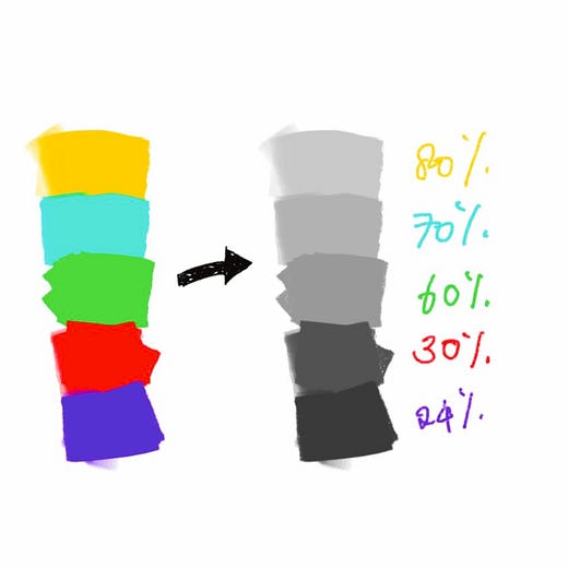
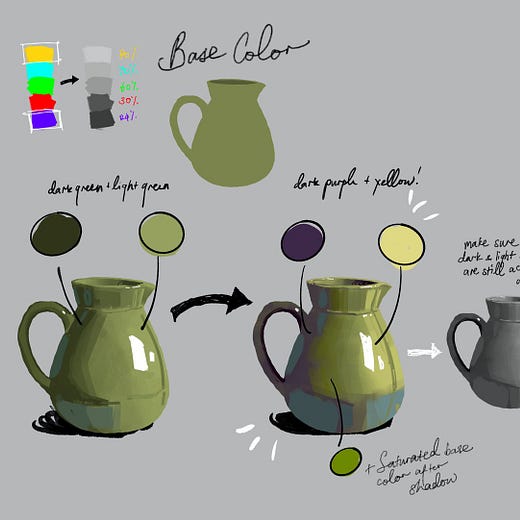
In Frozensoba’s example, shading purely with darker and lighter values is fine. I’d look at the green pot and think, “That’s nice”. But blending colors that are naturally brighter or darker adds a whole new dimension. The pot with purple and yellow comes to life.
How could this technique be used in flat illustrations? Instead of a gradient with banding lines, the brighter/darker colors could be overlayed with crosshatches and other textures. I’d like to see different techniques tested and shown in a grid.
Whenever I see something like this, I’m tempted to invest more time painting in Procreate.
Development: Composable Architecture
Renee Shah
Even though the ideas behind “composable architectures” are not new, it’s great to see the dev community embrace the term. We should have systems that are composed of modular components. APIs should be well-defined connectors to encourage interchangeability.
This opens the door for more people to launch startups. As our systems become more modular, it’s less necessary for new startups to build entire systems to get started. There are opportunities to extend existing systems by providing a single module. And if those modules could also be plugged into other systems, the startup mitigates risk by not being tethered to a single wagon.
Feedback: Camera Shake
Akash Hamirwasia
I love where this camera shake interface is headed. Dragging the smoothness left/right is a nice experience once you understand what that handle means. Dragging the strength up/down is much less intuitive.
So how do you make this interface more intuitive without overloading it with messaging?
I’d be tempted to explore using a single handle that can be moved on a 2D plane to control both smoothness and strength.
I think it’s important to ensure the handle is always attached to the line. This can be achieved if the strength is 0 if the handle is in the middle of the 2D plane. If the handle goes above or below that line, the strength is increased. This way the line can always bisect the handle.
It kills me to add persistent labels to interfaces if it can be avoided. Before adding a labeled graph for smoothness and strength, I’d try overlying 2 subtle gradients to hint at where to place the handle for more or less entropy. One gradient could represent the smoothness and be transparent on the left, with a fill on the right. The gradient representing strength could be transparent in the middle and fade into fills above and below the middle line.
The handle itself should hint at functionality rather than being a flat white circle. It could be bisected by a purple squiggle line with 4 white triangles around the circle to hint that it can be moved in any direction.
The above suggestions are probably a little confusing without a visual. So here is a crude screenshot.
Wildcard: Revenue-Based Financing
ethelcofie
I’m surprised RBF isn’t more common. It’s less risky for founders because it doesn’t require dilution, giving up control or risking collateral. I also think it’s better for investors because it aligns incentives, and you don’t have to wait 7+ years for a home run payout.
If I ever start a fund, I’d strongly consider blending RBF and DAO investments. I fundamentally believe in the decentralized promise of DAOs, but crypto is risky. That risk could be mitigated by RBF bets.


