{19} Typography, GraphQL & Macromedia
Featuring I Love Typography, Eve Porcello, Bryan Hutchinson, Femi Richard, and Web Design Museum
Design: Constraints
I Love Typography
I could watch type designers do their magic for hours. Seeing how beautiful curves and intricate shapes evolve out of crude foundations is a lesson not only in art but in life.
When I set out to design something, I also start with rough shapes. But I lack the creative confidence to adjust lines parallel to other lines. There are specific geometric rules that I’ve made up for myself that inhibit my ability to explore.
Self-imposed constraints can be a good thing. It’s easier to operate in a space with a limited set of rules vs full-on anarchy. But seeing a designer violate my self-imposed rules and immediately produce something beautiful is an important lesson.
Constraints should not be universal and blindly applied to any situation. Be conscious about your use of constraints. Apply them if it’s useful to the project at hand. But otherwise, feel free to break the rules.
Development: GraphQL Tip
Eve Porcello
I keep getting excited by the flexibility of GraphQL. Then I try to hack together a simple GraphQL-powered interface with Apollo, and it immediately feels heavy and overwhelming.
One of my biggest pains has been trying to cobble together a query to get back results. It’s so basic, but so I found the process unintuitive. I wish I had known the CTRL + Space hotkey to list queryable fields. That simple tip probably would have changed everything.
Marketing: I vs You vs We
Bryan Hutchinson
I can sympathize with readers not wanting to be told what to do. When someone is presumptuous enough to write on my behalf, I immediately question their motives. Do they really understand me, or are they just faking it to try and sell a used car?
As a writer, I also hate using the word “I”. It makes me feel self-absorbed and detached from the reader. That is unlikely in the vast majority of cases. In the examples Bryan shared, it’s easy to see how the use of “I” can make you vulnerable and trustworthy.
My default has always been to look for opportunities to use “we”. Creating a shared experience feels more approachable. But “we” can run into the same presumptuous traps as “you”.
I just need to get over the mental block and embrace the word “I”.
Feedback: Contrast
Femi Richard
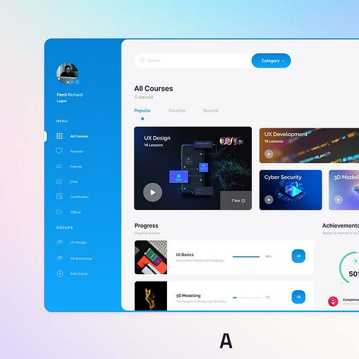
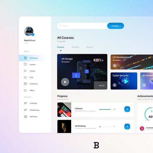
I strongly prefer the visual contrast of the dark blue elements in A. This helps frame the content and set it apart from the navigation. In B, less contrast requires a little more time to orient yourself and mentally organize things.
However, B is visually pleasing. Sometimes it’s worth giving up utility for a more enjoyable experience.
If the aesthetics were more divergent, I might consider B. But A is arguably as nice to look at while offering more utility. So I’d go with A.
Wildcard: Macromedia
Web Design Museum
I’m old enough to remember what it was like using these tools in 2002. That means I’ve been building things on the web for 20 years. 🎉
Most people fixate on the pain of using some of the early web development tools. Over the years, I’ve said nasty things about Flash and Dreamweaver. Those tools were objectively worse than what we use today, like Webflow and Figma. But modern tools owe everything to the pioneers that forged on after the dot-com bust and helped lay the groundwork for a better internet.
The internet we know today isn’t perfect. There is still a lot of work to do. I’m excited to see who will emerge as the “crypto Macromedia’s” after the latest crypto crash. Web3 is coming, and it’s going to take a few pioneers to make it happen.


